How To Build A User Settings Page In Five Minutes
Humans inherently desire to tune our environment to our needs. This desire also applies to our digital footprint — a fact that’s especially important to keep in mind when building SaaS applications.
Your users will need to craft their identity, and control their space, data, and overall experience, and that is why a good User/Account Settings page is a critical aspect of any SaaS that values its users’ needs.
In this article, we’ll cover building a User Settings page in your SaaS app in just five minutes, using Next.js as our framework of choice, and Saas UI — an open-source, reusable collection of accessible and customizable React components geared towards SaaS apps — as our component library.
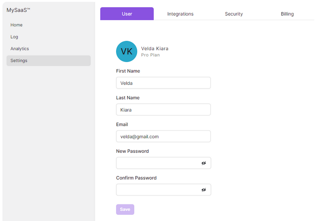
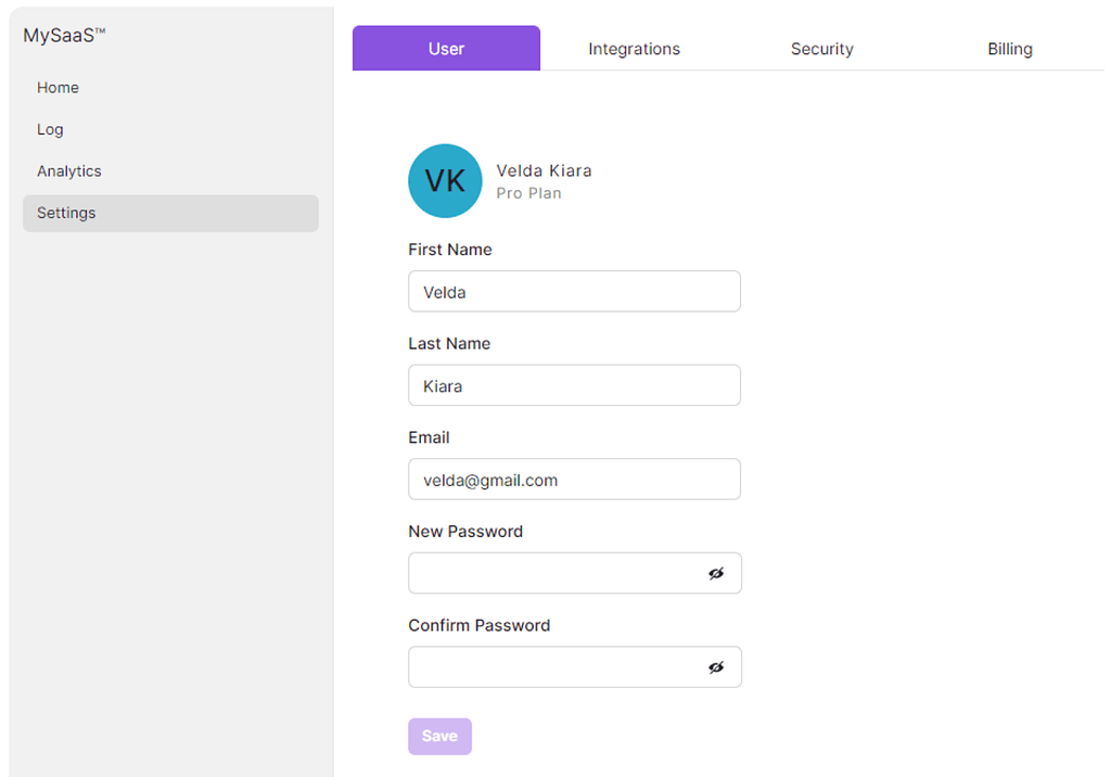
User Settings page
The Github Code for this tutorial can be found here.
Let’s get right to it!
Prerequisites
Installing Dependencies
a. Install NextJS
npx create-next-app@latest my-saas
b. Install Saas UI with its dependencies.
npm i @saas-ui/react @chakra-ui/react @emotion/react@^11 @emotion/styled@^11 framer-motion@^6
c. For the Sidebar, you’ll also have to install the Sidebar module, currently in beta.
npm i @saas-ui/sidebar
Adding the Saas UI Provider
For Saas UI to work properly, you need to wrap your NextJS app with the SaasProvider, which performs the base ChakraUI setup for you, adding global styles, the Saas UI base theme, and more.
In your _app.js , insert the following code:
// 1. import `SaasProvider` component
import { SaasProvider } from "@saas-ui/react";

export default function App({ Component, pageProps }) {
  // 2. Use at the root of your app
  return (
    <SaasProvider >
      <main>
        <Component {...pageProps} />
      </main>
    </SaasProvider>
  );
}
Creating the Settings Page
1. User Settings Form
Saas UI’s Form component uses React Hook Form, following the WAI(Web Accessibility Initiative) specifications to ensure accessibility.
💡 React Hook Form helps developers build forms in React with less code and built-in performance optimizations, and a seamless API use to manage state and validation logic.
The Form component provides particular props to customize the behavior of the form.
If you need to know which props this component takes, see here
./components/UserSettings.jsx
/* Chakra UI Imports */
import { Box, Flex } from "@chakra-ui/react";

/* Saas UI Imports */
import { Persona, Form, FormLayout, Field, SubmitButton } from "@saas-ui/react";

/* Custom Hooks */
import usePasswordMatch from "@/hooks/pwd";

export const UserSettings = () => {
  const {
    password,
    confirmPassword,
    isMatch,
    handlePasswordChange,
    handleConfirmPasswordChange,
  } = usePasswordMatch();

  const handleSubmit = (event) => {
    console.log(event);
    // Handle form submission here
  };
  return (
    <>
      <Box padding="8">
        <Flex alignItems="start" marginBlock="4">
          <Persona
            name="Velda Kiara"
            secondaryLabel="Pro Plan"
            size="lg"
            letterSpacing="0.78px"
          />
        </Flex>

        <Form
          onSubmit={handleSubmit}
          defaultValues={{
            firstName: "Velda",
            lastName: "Kiara",
            email: "[email protected]",
          }}
        >
          <FormLayout>
            <Field
              backgroundColor="white"
              textColor="black"
              name="firstName"
              label="First Name"
              width="20.5em"
              rules={{ required: true }}
            />
            <Field
              backgroundColor="white"
              textColor="black"
              name="lastName"
              label="Last Name"
              width="20.5em"
              rules={{ required: true }}
            />
            <Field
              backgroundColor="white"
              textColor="black"
              name="email"
              label="Email"
              type="email"
              rules={{ required: true }}
              width="20.5em"
            />
            <Field
              fontFamily="mono"
              backgroundColor="white"
              textColor="black"
              type="password"
              name="password"
              label=" New Password"
              value={password}
              width="18em"
              rules={{ required: true }}
              onChange={handlePasswordChange}
            />
            <Field
              fontFamily="mono"
              backgroundColor="white"
              textColor="black"
              type="password"
              name="confirmPassword"
              label="Confirm Password"
              value={confirmPassword}
              width="18em"
              rules={{ required: true }}
              onChange={handleConfirmPasswordChange}
            />
            {!isMatch && <p className="highlight">Passwords do not match</p>}
            <SubmitButton marginBlockStart="10px" disableIfInvalid>
              Save
            </SubmitButton>
          </FormLayout>
        </Form>
      </Box>
    </>
  );
};
Here’s what we’re using from the @saas-ui/react library for our User Settings form.
- Persona, for a simple user avatar component with optional labels (say, listing the current plan this particular user is being billed for)
- Form, with its associated components — FormLayout, Field, and SubmitButton. These are the building blocks of our form and should be self-explanatory.
For our basic layouts, we’re also taking Box and Flex from the base ChakraUI library itself to save time. This is entirely optional, and you could build your own layouts from scratch if you want.
💡 The defaultValues prop of the Form component sets the default values because our tutorial app assumes the user has already signed in to the SaaS Application.
The usePasswordMatch hook is imported locally from a module called pwd. This is a custom password validation hook we’re using, that returns an object with the three properties:
- isMatch
- handlePasswordChange, and
- handleConfirmPasswordChange
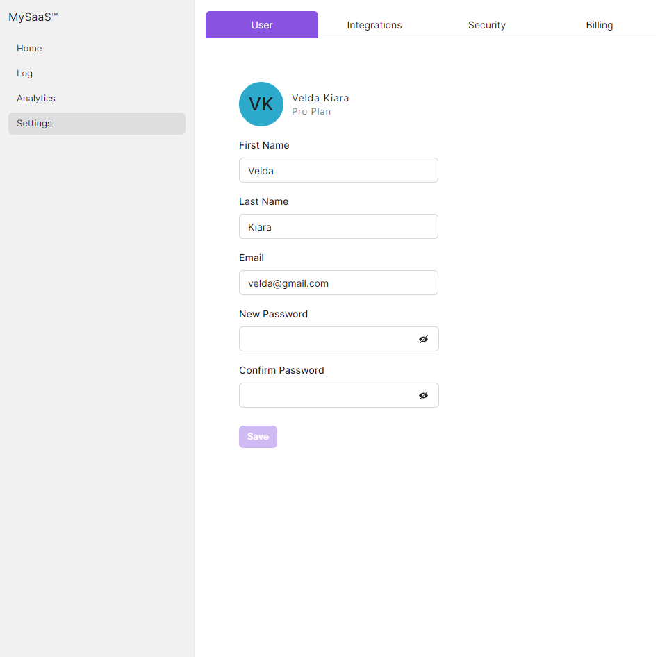
These are used for the two password fields in our form and also for conditionally rendering an error message (“Passwords do not match”) if they do not match.
Let’s implement this module right now.
2. Custom Hook for Password Management
We’ll create thatusePasswordMatch hook now.
./hooks/pwd.js
import { useState } from "react";

const usePasswordMatch = () => {
  const [password, setPassword] = useState("");
  const [confirmPassword, setConfirmPassword] = useState("");
  const [isMatch, setIsMatch] = useState(true);

  const handlePasswordChange = (e) => {
    setPassword(e.target.value);
    setIsMatch(e.target.value === confirmPassword);
  };

  const handleConfirmPasswordChange = (e) => {
    setConfirmPassword(e.target.value);
    setIsMatch(e.target.value === password);
  };

  return {
    password,
    confirmPassword,
    isMatch,
    handlePasswordChange,
    handleConfirmPasswordChange,
  };
};

export default usePasswordMatch;
You could make your password management logic as simple or complex as you wanted, but for now, we’re just including one simple validation — check if the value in the password field matches the one in the ‘confirm password’ field, and return a boolean value for isMatch, accordingly.
Let’s quickly explain this code.
- The useState hook is used to set and manage the state of the password, confirmPassword and isMatch.
- Once the user starts to type in the password input field, handlePasswordChange is called to update the password state by checking if it matches the value of the password.
- Same with the confirm password input field with the handleConfirmPasswordChange function.
- The hook itself returns an object that contains password, confirmPassword, isMatch, handlePasswordChange, and handleConfirmPasswordChange.
3. The Sidebar
Our Sidebar component for the Account Settings page is pretty simple. Saas UI offers a Sidebar component out of the box (this is currently in beta!), and we’ll just use that as a minimal example.
./components/MySidebar.jsx
/* Saas UI - SideBar Imports */
import { Sidebar, SidebarSection, NavItem } from "@saas-ui/sidebar";

/* Saas UI & Chakra UI Imports */
import { Spacer } from "@chakra-ui/react";

export const MySidebar = () => {
  return (
    <>
      <Sidebar breakpoints={{ base: false }} backgroundColor="gray.100">
        <SidebarSection direction="row">
          MySaaS™
          <Spacer />
        </SidebarSection>
        <SidebarSection aria-label="Main " textColor="white">
          <NavItem>Home</NavItem>
          <NavItem>Log</NavItem>
          <NavItem>Analytics</NavItem>
          <NavItem isActive>Settings</NavItem>
        </SidebarSection>
      </Sidebar>
    </>
  );
};
Let’s quickly explain this code:
- The MySidebar component is responsive and minimizes into a hamburger menu on smaller screens. For our particular design, we don’t want this behavior, so we disable it with breakpoints={{ base: false }} This is entirely optional though, and depends on what design you have in mind for your own SaaS.
- Each navigable item in this sidebar is a NavItem, and we mark the Settings page as active with isActive (defaulting to true). In a real world app, you’d manage this value, passing state.
Not much else to say here, let’s move on to our main page at index.js, which has a tabbed display!
4. Index.js
Our main page is, once again, simple enough, with one caveat — for our main content section we’re using a tabbed display, with our UserSettings component being one of them.
./pages/index.js
import Head from "next/head";
/* Saas UI & Chakra UI Imports */
import { AppShell } from "@saas-ui/react";
import { Box, Tabs, TabList, TabPanels, Tab, TabPanel } from "@chakra-ui/react";
/* My Components */
import { UserSettings } from "../components/UserSettings.jsx";
import { MySidebar } from "../components/MySidebar.jsx";
export default function Home() {
return (
<>
<Head>
<title>MySaaS > Account Settings</title>
<meta name="description" content="Generated by create next app" />
<meta name="viewport" content="width=device-width, initial-scale=1" />
<link rel="icon" href="/favicon.ico" />
</Head>
<div className="container">
<AppShell sidebar={<MySidebar />}>
<Box h="100%" w="100%" padding="1em">
<Tabs isFitted size="md" variant="enclosed">
<TabList>
<Tab _selected={{ color: "white", bg: "primary.500" }}>
User
</Tab>
<Tab _selected={{ color: "white", bg: "primary.500" }}>
Integrations
</Tab>
<Tab _selected={{ color: "white", bg: "primary.500" }}>
Security
</Tab>
<Tab _selected={{ color: "white", bg: "primary.500" }}>
Billing
</Tab>
</TabList>
<TabPanels>
<TabPanel>
   <UserSettings />
</TabPanel>
<TabPanel>
<p>Integrations Here!</p>
</TabPanel>
<TabPanel>
<p>Security Here!</p>
</TabPanel>
<TabPanel>
<p>Billing Here!</p>
</TabPanel>
</TabPanels>
</Tabs>
</Box>
</AppShell>
</div>
</>
);
}
We’re in the home stretch now!
So, for our index.js, we’re enclosing our app in , which is the starting point to building composable UIs with Saas UI. This is a collection of components shared throughout your app — and it is where you’d include your header, navbar, sidebar, footers, etc. No surprises then, that we’re passing our Sidebar component as the sidebar prop for it.
For the main content, we’re going with a tabbed page that lets our SaaS’ users manage various settings like Billing, third party integrations, security options, and most importantly — the component we’ve built to manage their Profile/User settings. For this, we can just use the Tabs component from the base ChakraUI library itself, specifically, the Fitted Tabs variant which fills the space of the container it’s in, adjusting each tab’s dimensions automatically.
Finally, as you might’ve guessed already, to make this tabbed section work, each component you design needs to be enclosed by a TabPanel, like so:
<TabPanel>
<UserSettings />
</TabPanel>
5. Styling
We’ve handled our component styling using Saas UI/ChakraUI’s native styling solution, and for miscellaneous global styles, let’s use Saas UI’s theming.
Go back to _app.js, and modify it slightly to import the base Saas UI theme, and extend it for our own needs. Here’s what it’ll look like now.
// 1. We're extending the base Saas UI theme,
// so import the extendTheme function.
import { extendTheme } from '@chakra-ui/react'

// 2. Add an import for the base Saas UI theme here
import { SaasProvider, theme as baseTheme } from '@saas-ui/react'

// 3. Extend base theme to include the values we want applied globally
export const myTheme = extendTheme(
  {
    styles: {
      global: {
        '.container': {
          height: '$100vh',
        },
        '.highlight': {
          color: 'red',
          fontSize: '0.9rem'
        }
      },
    },
  },
  baseTheme
)

export default function App({ Component, pageProps }) {
  // Use SaasProvider as usual, but this time passing in your custom theme.
  return (
    <SaasProvider theme={myTheme} >
      <main>
        <Component {...pageProps} />
      </main>
    </SaasProvider>
  );
}
Explanations:
- ChakraUI automatically removes any default padding or margin applied by the browser,
- Saas UI lets you use your own design system by using Design Tokens. Covering this in detail is outside the scope of this tutorial, but essentially, we’re extending the base Saas UI theme with new classes that apply globally, and we’re representing these new CSS classes as key-value pairs.
- The container class here for example, just makes the div we’ve been using to wrap our entire app take up the whole screen in both axes.
- The highlight class (used for the error message displayed when passwords do not match) simply sets that text’s color to red.
To learn more about customizing themes in Saas UI, read this.
All done! Fire up your browser, and you should see this.
Conclusion
Hopefully this article has shown you just how easy Saas UI makes building a beautiful, accessible, and intuitive user settings page!
To this end, we took a step-by-step approach that covered installing dependencies, adding the Saas UI provider, adding a functional Sidebar, and creating a user settings form using Saas UI’s built-in React Hook Form implementation (with out-of-the-box WAI-ARIA compliance). Following this approach, you can easily create your own user settings page for your SaaS app that aligns with your users’ needs and preferences.
So, may your keyboard be swift, your bugs be few, and your fun meter be off the charts as you code away!